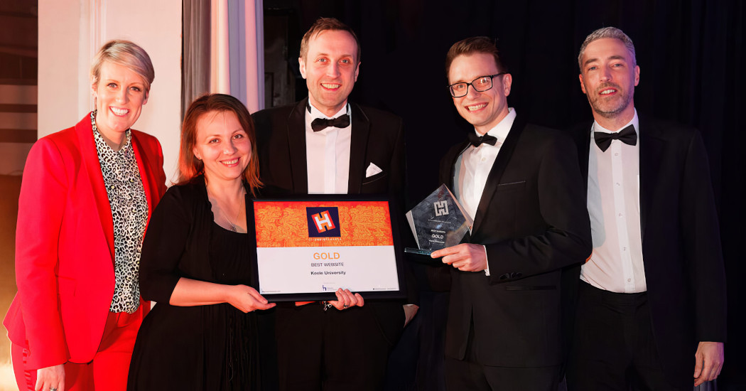
Keele website project, 2018
Our brief was vast yet simple: our core website needed transforming - within 12 months. After ten years of service, the Keele University website was no longer fit for purpose. The design and templates were outdated, the site was not fully responsive, and the website ultimately did not meet audience needs or expectations in the provision of a user friendly, useful and visually appealing content hub for students, parents and advisors. With over 12,000 pages, split across dozens of distinct sections, the site suffered from complex and confusing user journeys.
Our aim was to introduce an improved, consistent design reflecting Keele’s unique brand and campus, with accessible and responsive mechanics. As well as transforming the structure, we also simultaneously needed to introduce a content strategy to drive engaging and dynamic content, as well as reducing the overall number of pages and CMS editors. Other objectives were to improve load speed by 25%, achieve an SEO score of over 90% (Chrome), and ultimately increase applications.
The project followed an Agile methodology, and project governance was through AgilePM methodology, including the use of Trello and Google Sheets. Project communication was important throughout, and we wrote regular project blogs, updated stakeholders via emails, and delivered project roadshows.
All of our decisions were evidence-based. We began by speaking to over 100 people face-to-face, including with local college students, and almost 700 people via surveys. Our research brought to light the state of our externally-facing digital presence, the technical divide between external and internal needs, and the nature, quality, and value of our content. Additionally, we reviewed Google Analytics, Hotjar, and SiteImprove to analyse SEO and accessibility quantitative data.
Following this, we worked with our digital agency to produce stakeholder personas to identify our core audiences, which was instrumental in shaping a new site architecture. Content reduction and card sorting exercises assisted in organising and labelling the content within the new structure. We then designed a range of templates through an iterative process, starting with mobile and desktop wireframes before developing each template. The user interface was built using an atomic design methodology to promote consistency and re-usability.
We faced some issues around site support in older browsers and Edge HTML. By using a package called Laravel Mix, we were able to check for errors, compress code and also applied prefixes or fallbacks.
Producing a consistent navigation across devices was one of the most challenging aspects of the build, due to the scale of the site requiring the navigation to contain upwards of 500 links. We were able to implement a responsive component to provide a friendly, consistent navigation experience.
What were the outcomes?
We launched phase one of the new site in April 2018. This included the homepage, ‘Study’ section - including all course pages - the ‘Discover’ and ‘Connect’ sections, and also a new course search and site search. Collectively, these 1,500 core pages account for 50% of our site traffic.
We launched with no downtime and no increase in the percentage of broken links, thanks in part to the 1,000 server-side 301 redirects we set up. We now monitor the effectiveness of the website through a combination of Google Analytics, including weekly 404 reports, Hotjar heatmaps, SEO Spider audits, and surveys.
Post launch, we ran an opt-in website survey and found that 97% of potential and current undergraduate applicants found the site easy/very easy to navigate, and 100% found the site's content useful and the site good/very good overall.
Making simple changes such as including entry requirements on course pages, and adding improved metadata, means that the site scores 100 for SEO (Chrome). Overall, we increased organic search and direct web traffic by 21% to 1.9m visits in 2018.
Lean development was at the core of our build strategy to ensure the site offered fast load times across devices by using a number of techniques and progressive, modern frameworks. The average mobile load time on 3G is four seconds, a 43% improvement on the old site (testmysite.withgoogle.com), and despite the homepage now being image-led, the new optimised code means that 50% fewer server requests are made. As a result, site speed from Hong Kong has improved by 23%, and by 50% from North America (GTmetrix). We are proud to have won a ‘Certificate of Mobile Excellence’ from Awwwards.com, with the site scoring 80% for mobile friendliness and best practice, and 100% for usability.
During Clearing 2018, the website loaded 1.2 seconds quicker than in 2017, and had 17,000 page views, up 21% on 2017. Additionally, we can report 43,000+ unique clicks to open day booking forms since launch. This all contributed to the biggest ever undergraduate intake in our history, and supported our five-year plan which resulted in the second highest growth in the entire sector.
We previously had six different page templates and 144 content types within our CMS which had become difficult to manage. Having worked on the site architecture and consistency of the interface, we implemented just one single page template which is flexible enough to be used across the whole site. We also implemented a set of 38 AA accessible content types, which were carefully designed to present content in a variety of suitable formats such as tabs, accordions and carousels.
To improve the search experience, we transitioned from our old provider Funnelback to cloud search provider Algolia for our course search, and Google CSE for our site search. This saved us up to £40,000, and long term will allow us to build search features in-house with much more effective results for users.
A new baby. A house move. A burst appendix
These were just three of the challenges that our small project team overcame in the 12-month period leading to the launch of the website, on top of business-as-usual demands and the odd crisis here and there.
But despite all this, our website was launched on time - and even 10% under budget.
We tackled the project with passion and vigour. We have been working hard to turn heads. We are very proud of our work.
As a core project team of just 2.5 FTE, our attitude was dynamic and can-do. Always professional and courteous, but willing to challenge each other’s decisions and strive for the best site we could deliver. We used an agile mindset, and a combination of daily stand-ups, Trello boards, and many sitemaps (plus the occasional tea break huddle) to make sure we kept on top of things.
Having three children under the age of five, Web Development Manager Chris was often knackered. Yet despite this, Chris implemented all of the templates into the CMS single-handedly (that’s over 30,000 lines of code) thanks to our flexible working policy, and his natural calmness and drive to develop his skills in new web technologies kept the project on track and future-proofed. By leading on this work entirely in-house, we saved tens of thousands of pounds in CMS consultancy fees.
Web Officer Galina has a fantastic eye for details. Whether it’s knocking extra KBs off image to improve mobile download speed, or making sure site content is kept within the style guide, Galina was on top of it throughout and helped deliver a quality website.
Web Content Manager Chris joined us on a short contract halfway through the project, and was a valuable addition to the team.
Paul is writing this blog, so can’t comment on himself. Oh, go on then, I think we’ve done an incredible job!
We are now in a phase of continuous enhancement, continually striving to improve the website. An example of such is the forthcoming introduction of Webp to speed up image delivery through compression.
Phase two of the project is concerned with the transformation and migration of all local departmental and school pages, which collectively account for the remaining 50% of web traffic, and is focused on content as opposed to the technical work already completed in the first phase. This phase requires in-depth collaboration, and involves reviewing over 10,000 individual web pages, including 200 microsites, 30 school sections, and 10 directorate and departmental sections. These sections are very complex, many with hundreds of documents behind the pages.
Paul Newton
Paul is Associate Director of Strategic Communications and Brand at Keele University, with responsibility of the University’s press office, internal communications, social media engagement, web development, and design functions.